|
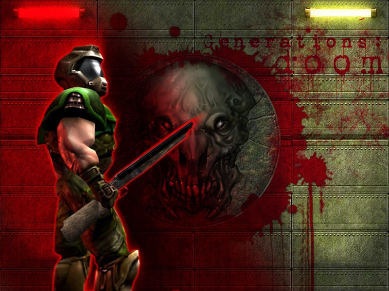
crazy.joe Doom w/red lights
| Position 4 overall, due to these votes: | ||
| Excellent | : | 17 votes |
| Great | : | One vote |
| Good | : | One vote |
| From: | UltimiteDooM | (Tue Feb 24 21:11:01 2004) |
| That is the most Coolest Pic of DooM i have ever seen... | ||
| From: | frightfan@hotmail.com | (Fri Sep 10 14:30:26 2004) |
| Great image... though I would leave off the highlight around the Doom Soldier. It would be better to have him naturally lit by the two bulbs. The red in the picture doesn't look like light. | ||
| From: | Gnam | (Mon Oct 11 16:41:13 2004) |
| I like the red, but I think the red outline around the shotgun is too stark and should be more subtle. | ||
| From: | c3rb` | (Mon Nov 15 22:47:59 2004) |
| Pretty good pic, (luv the letters on the wall) but i don't think the red highlight around Doom is needed. | ||
|
||||||
|

|
RSS |
